Creating the visual foundation for Android’s web presence
The Android.com redesign introduced a new approach to how users explore Android products and features. Along with the visual update, a design system was created to unify style, structure, and interaction across the platform, improving consistency and collaboration between teams.
UI design, Design Systems
Android.com
Webby Award 2024 – Best Mobile Visual Design (Aesthetic)
Creativepool 2024 – Silver & People’s Choice
Defining the core system
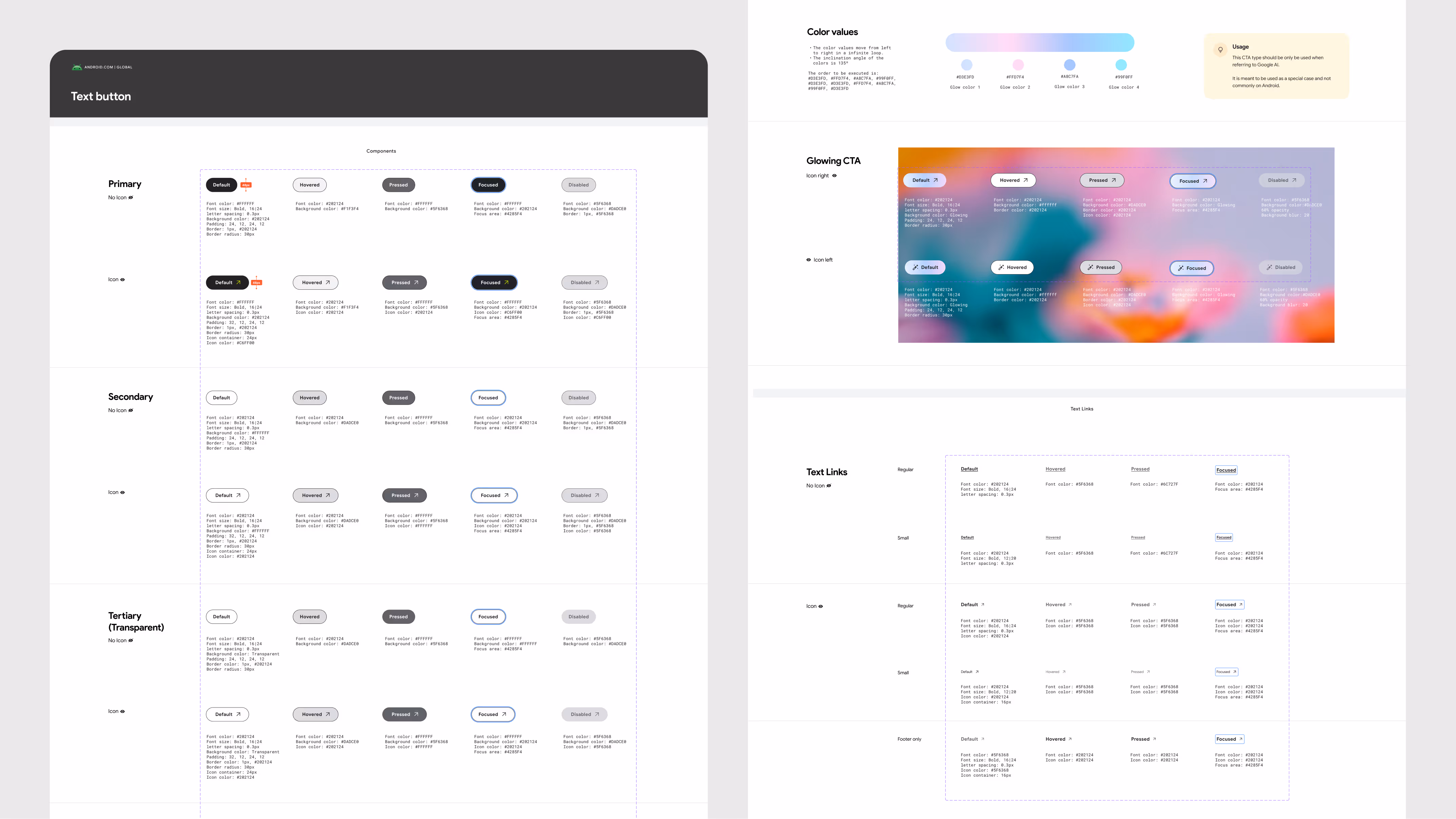
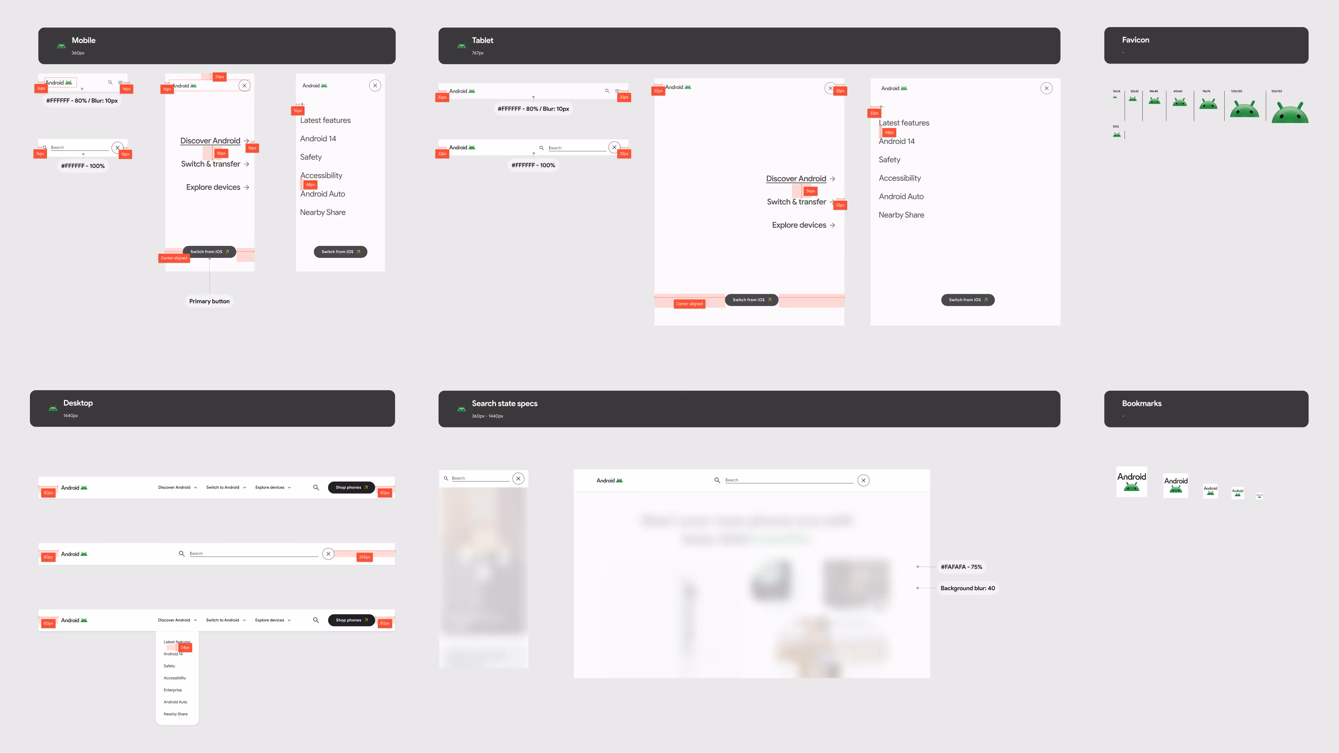
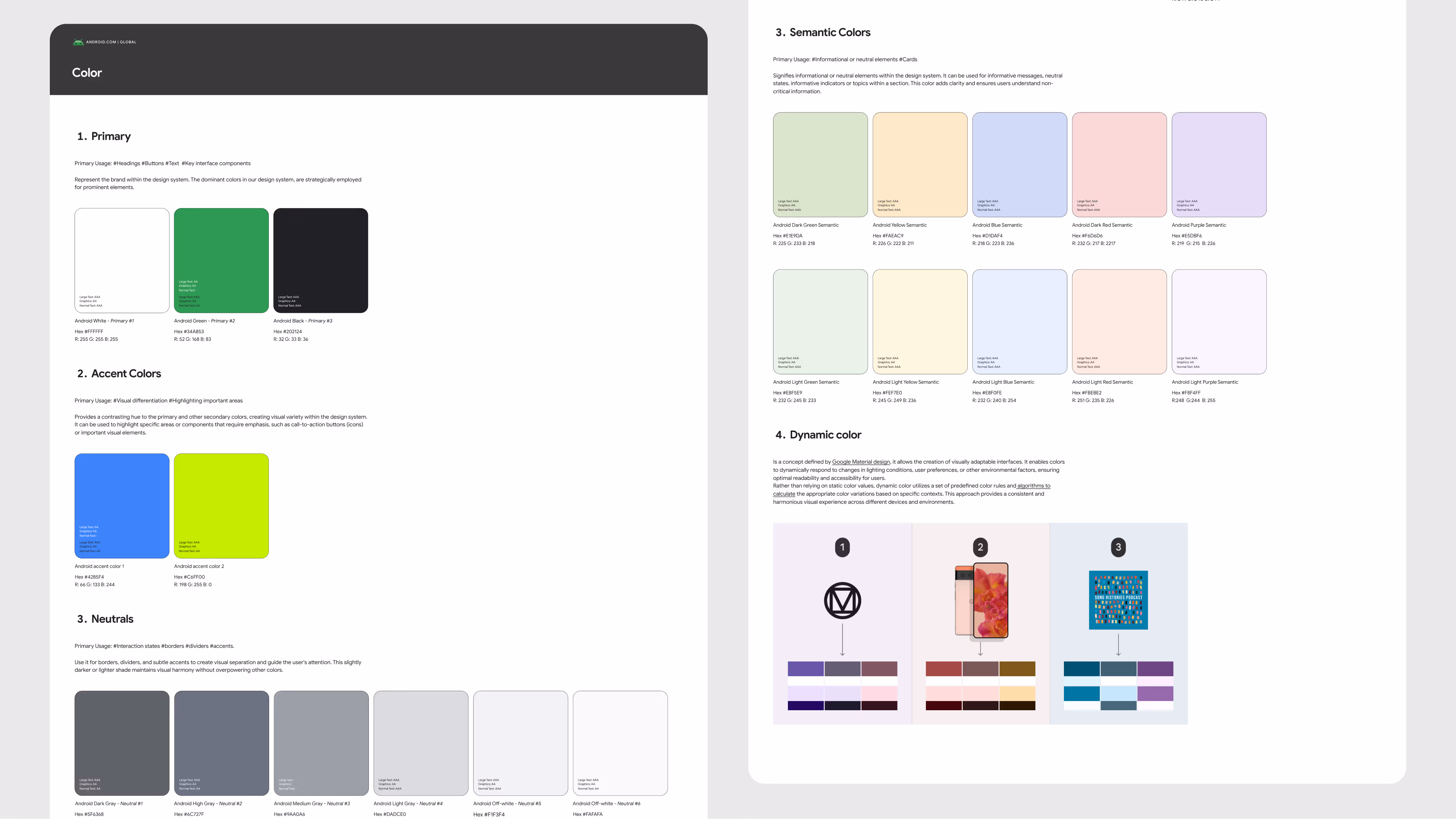
The main challenge was to build a design system from the ground up. The team defined the foundations — color, typography, grid, spacing, and elevation — and later expanded into navigation, footers, buttons, icons, and pagination. Each element was documented with clear specifications, accessibility standards, and real use cases, creating a single source of truth for Android teams.

Outcomes
+17% more people explored Android devices — more visitors clicked to 'learn about phones' and 'partners'.
+5.2M more interactions — more users discovered Android features and apps on Google Play.
1x Webby Award — recognized with two nominations and one People’s Voice Winner.
16M+ monthly visitors — steady growth and a smoother browsing experience.
Huge
Melissa Castaño - Visual design lead
Kisha Bertrand - Lead copy writer
Mateo Torres - Product Management
Next project
Google for Education - Leader & Admin Community web pages